
For any non-profit organization, the ultimate goal is for your website to maximize donations.
However, putting up a “donate now” link just isn’t going to cut it.
Like any actionable website component, it’s important to optimize your donation buttons to ensure that they are being seen by your donors and are compelling them to take immediate action.
Below are some simple updates and tweaks you can make to optimize your donation button:
Stand Out:
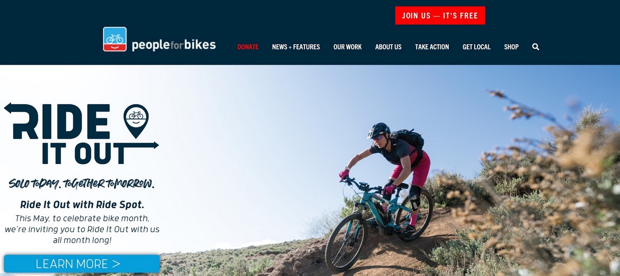
In your navigation bar, highlight the donation button to make it stand out and easier to see. Create a button with an on-brand, bright, and vivid color that contrasts the menu to ensure it is easy to find when skimming. Play with font weights as well, to make sure that your button pops from “less crucial” navigation items.
This approach can be mirrored “on-page”. Wherever you are creating opportunities for your audience to take a “donate” action, make the button more prominent than other, secondary calls-to-action. Other small tweaks to try is to make the button bigger than any other button on your site or change the font size. Anything to make it clear for where your donors should go will help with conversion – and donations!
Words Matter:
From a study conducted by raisedonors.com, donation button wording is integral to increasing donations. In one of their studies, they showed 190% increase in donations with some simple wording tweaks.
The words “Donate” and “Support” are far more effective and action-focused words than “Click here”. Leveraging action-inducing verbiage definitely helps with click rates.
Value leads to action:
This one is a little less about the button itself and more about the context in which the button is presented.
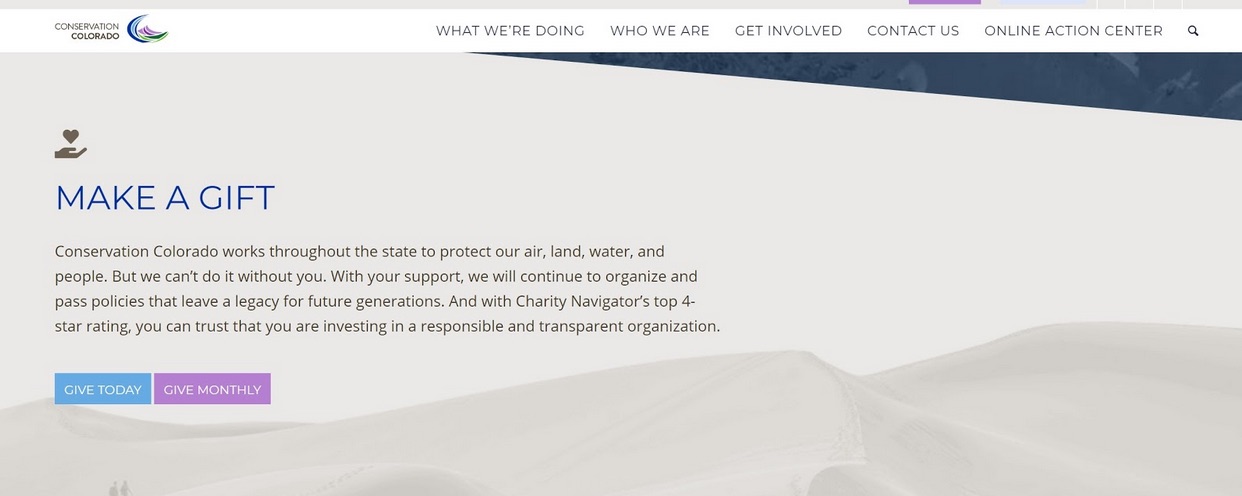
When creating a donation section, make sure that your copy is value-driven and inspires your donors to take action. Whether that is talking about where their donation goes or who it helps, making an emotional connection helps to increase button clicks. Creating a context for your call-to-action and really getting to the nuts and bolts of how your audience’s contribution will be used to benefit the world.
Rule of 3:
Over 75% of people who visit a website will scan a page instead of reading the whole content. For your donation button, it is important to place it on your page in multiple places to ensure that it is seen while someone is skimming the page.
We recommend placing the donation button in three places on each page. In the menu, in the middle of the page, and at the bottom of each page.
Remember, with any changes you make to your site, it’s always important to test the effectiveness of your updates. Identify what you want to try with the donation button and test each component one at a time. Find what works best for you and your donors and then duplicate that across your website.
With some simple tweaks, you can easily have your donation button convert more of your site visitors to donors.
Need some help tweaking your site or have any questions about your donation pages? Set up a call and we’d be more than happy to take a quick peek and see what you can do to improve your site.